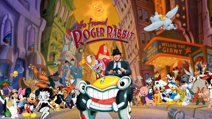
Step into the whimsical and enigmatic world of “Who Framed Roger Rabbit” through its captivating movie poster. This visual masterpiece, released in 1988, has become an iconic symbol of the film and the era it represents. Its unique blend of live-action and animation, along with its compelling characters and atmospheric setting, has left an indelible mark on popular culture.
From its striking composition to its intricate symbolism, the “Who Framed Roger Rabbit” poster is a testament to the artistry and creativity that went into its creation. Join us as we delve into the design, symbolism, and cultural significance of this iconic piece of movie memorabilia.
Design and Composition
The poster for “Who Framed Roger Rabbit” is a visually striking and iconic piece of design that captures the whimsical and chaotic spirit of the film. It features a vibrant and contrasting color palette, bold shapes, and a playful typography that all work together to create a memorable and eye-catching image.
One of the most striking aspects of the poster is its use of contrasting colors. The background is a bright and sunny yellow, which immediately draws the eye and creates a sense of warmth and optimism. In contrast, the characters are depicted in a range of darker colors, including black, blue, and red.
This contrast helps to create a sense of depth and dimension, and it also makes the characters stand out from the background.
The shapes used in the poster are also very effective in creating a sense of visual interest. The main character, Roger Rabbit, is depicted in a dynamic and exaggerated pose, with his arms and legs outstretched. This creates a sense of movement and energy, and it also helps to draw the eye to the center of the poster.
The typography used in the poster is also very playful and effective. The title of the film is written in a bold and stylized font, which helps to create a sense of excitement and anticipation. The rest of the text on the poster is written in a smaller and more subdued font, which helps to create a sense of balance and harmony.
Color Palette
The poster’s color palette is dominated by contrasting shades of yellow and blue, with accents of red and black. The bright yellow background creates a sense of warmth and optimism, while the darker blues and blacks of the characters add depth and dimension.
The use of red is particularly effective in drawing attention to certain elements of the poster, such as the title and Roger Rabbit’s carrot. The black Artikels around the characters help to define their shapes and make them stand out from the background.
Shapes and Composition
The shapes used in the poster are bold and dynamic, creating a sense of movement and energy. Roger Rabbit’s exaggerated pose, with his arms and legs outstretched, draws the eye to the center of the poster.
The other characters are arranged around Roger in a circular composition, which creates a sense of unity and balance. The use of negative space around the characters helps to create a sense of depth and dimension.
Typography
The typography used in the poster is playful and effective, with the title of the film written in a bold and stylized font. The rest of the text is written in a smaller and more subdued font, which helps to create a sense of balance and harmony.
The use of different fonts and sizes helps to create a hierarchy of information, with the title of the film being the most prominent element. The smaller text provides additional information, such as the names of the cast and crew.
Characterization and Portrayal
The poster of “Who Framed Roger Rabbit” presents a vibrant and dynamic depiction of its two main characters, Roger Rabbit and Eddie Valiant. Their expressions, body language, and interactions provide insights into their personalities and set the tone for the film.
Roger Rabbit
Roger Rabbit is portrayed as a mischievous and charismatic toon. His wide-eyed expression and mischievous grin convey his playful and carefree nature. His exaggerated body language, with his arms flailing and legs kicking, adds to his cartoonish charm. Roger’s stance, with his legs slightly apart and his weight shifted forward, suggests a sense of confidence and excitement.
Eddie Valiant
In contrast to Roger, Eddie Valiant is depicted as a cynical and world-weary private investigator. His stern expression and furrowed brow reflect his hard-boiled demeanor. His body language is more reserved, with his arms crossed and his weight evenly distributed.
Eddie’s stance, with his feet planted firmly on the ground, conveys a sense of determination and stability.
Interaction between Characters
The interaction between Roger and Eddie on the poster captures the film’s blend of comedy and mystery. Roger’s playful gestures and exaggerated expressions contrast with Eddie’s serious and reserved demeanor. This contrast highlights the differences between the two characters and sets up the comedic tension that drives the film.
Setting and Atmosphere
The poster’s depiction of Toon Town is a bustling and vibrant metropolis, capturing the essence of the film’s fantastical setting. The use of bright colors and exaggerated perspectives creates a sense of wonder and excitement, inviting viewers into the zany and chaotic world of the Toons.
Lighting and Shadows
The poster’s lighting and shadows play a crucial role in establishing the film’s atmosphere. The warm, golden light emanating from the city’s buildings and streets creates a sense of coziness and familiarity, while the contrasting shadows cast by the Toons’ silhouettes add an element of mystery and intrigue.
The interplay of light and shadow evokes a sense of both comfort and unease, hinting at the underlying tensions between the Toons and humans.
Perspective
The poster’s perspective is intentionally distorted, creating a disorienting and dreamlike atmosphere. The buildings of Toon Town appear to stretch and warp in all directions, giving the impression that the world is constantly shifting and evolving. This exaggerated perspective reflects the chaotic and unpredictable nature of the Toons’ existence, where anything is possible and the rules of reality are constantly being broken.Overall,
the poster’s setting and atmosphere perfectly capture the essence of Who Framed Roger Rabbit, creating a world that is both enchanting and unsettling, inviting viewers to explore the boundaries between reality and fantasy.
Symbolism and Motifs
The poster for Who Framed Roger Rabbit is replete with symbolism and motifs that enhance its narrative and thematic depth. These visual elements provide hidden meanings and references that add layers of complexity to the film’s story and characters.
Toons and Reality
The poster juxtaposes the world of toons and the world of reality, creating a visual tension that reflects the film’s central conflict. The bright, vibrant colors and exaggerated features of the toons contrast with the muted tones and realistic textures of the human world.
This visual contrast symbolizes the inherent differences between the two worlds and the challenges of bridging the gap between them.
Light and Shadow
Light and shadow play a significant role in the poster. The bright spotlight illuminates Roger Rabbit, highlighting his vulnerability and isolation. The shadows that surround him represent the darkness that threatens to consume him and the secrets that he carries.
The interplay of light and shadow creates a sense of mystery and intrigue, drawing the viewer into the film’s world.
The Carrot
The carrot is a recurring motif throughout the poster. It appears in Roger’s hand, on the signpost, and even as a silhouette in the background. The carrot symbolizes both temptation and danger. It represents the allure of the human world that Roger longs for, but it also foreshadows the risks and consequences that come with crossing the boundary between toons and reality.
Typography and Text
The poster for Who Framed Roger Rabbit uses a combination of playful and elegant typography to capture the film’s unique blend of live-action and animation.
Choice of Fonts
The main title of the poster is set in a bold, retro-inspired font that evokes the golden age of Hollywood animation. The playful curves and rounded edges of the letters add a sense of whimsy and nostalgia.
Colors
The poster’s color scheme is dominated by vibrant reds and yellows, which create a sense of excitement and energy. The use of black and white for the background and character Artikels adds a touch of sophistication and balance.
Placement of Text
The text on the poster is carefully placed to create a dynamic and eye-catching composition. The main title is positioned at the top of the poster, where it immediately grabs the viewer’s attention. The character names and credits are arranged in smaller, more subtle fonts along the bottom of the poster, allowing the artwork to take center stage.
Cultural and Historical Context
The poster for Who Framed Roger Rabbit was created in 1988, at the height of the postmodern era. This period was characterized by a playful and ironic attitude towards the past, and a fascination with popular culture and media.
The poster reflects these trends, with its playful and irreverent depiction of classic cartoon characters. The use of bright colors and exaggerated forms is also typical of the postmodern aesthetic.
Influence of Contemporary Trends
The poster was also influenced by the contemporary trend of “crossover” films, which combined live-action and animation. Who Framed Roger Rabbit was one of the first films to successfully combine these two genres, and the poster helped to create excitement for the film’s release.
Reception and Legacy
The poster was a critical and commercial success, and it helped to establish Who Framed Roger Rabbit as a classic film. The poster’s playful and irreverent style has also influenced subsequent films and posters, and it remains one of the most iconic images of the 1980s.
Marketing and Impact
The marketing campaign for the “Who Framed Roger Rabbit” poster was extensive and well-executed, utilizing various channels to reach a wide audience. The poster was distributed through traditional outlets such as movie theaters, magazines, and newspapers, as well as through innovative and unconventional means, including guerrilla marketing tactics.
The poster’s impact on the film’s promotion and success was significant. It became an iconic image, synonymous with the film and its unique blend of live-action and animation. The poster’s striking visuals and clever tagline, “The Toons Have Finally Gone Hollywood,” effectively captured the film’s essence and generated widespread interest.
Public Perception and Expectations
The poster played a crucial role in shaping public perception and expectations of the film. It conveyed the film’s genre-bending nature, hinting at the seamless integration of live-action and animation. The poster’s depiction of Roger Rabbit as a charming and mischievous character also helped establish the film’s tone, setting expectations for a humorous and entertaining experience.
Legacy and Influence
The iconic “Who Framed Roger Rabbit” poster has left an enduring legacy in popular culture, influencing both film posters and marketing campaigns. Its unique blend of live-action and animation, combined with its striking visuals and memorable tagline, has made it an instantly recognizable symbol of the film and the era in which it was created.
Impact on Subsequent Film Posters and Marketing Campaigns
The “Who Framed Roger Rabbit” poster revolutionized film poster design, setting a new standard for creativity and innovation. Its groundbreaking use of animation and live-action elements paved the way for subsequent posters to explore similar techniques, pushing the boundaries of poster design and marketing.
The poster’s success also influenced marketing campaigns, demonstrating the power of visual storytelling and the effectiveness of combining different media to create a memorable and impactful experience.
Iconic Symbol of the Film and Era
The “Who Framed Roger Rabbit” poster has become an iconic symbol of the film and the 1980s. Its unique visual style and memorable tagline, “The Toon That Changed Everything,” encapsulate the film’s blend of humor, nostalgia, and technical innovation. The poster has been widely reproduced and referenced in popular culture, serving as a reminder of the film’s enduring legacy and its impact on the entertainment industry.
Last Recap
The “Who Framed Roger Rabbit” poster is more than just a marketing tool; it is a work of art that captures the essence of the film and its enduring legacy. Its visual brilliance, captivating characters, and timeless appeal have made it an enduring symbol of the golden age of Hollywood animation.
As we continue to appreciate its artistry and cultural significance, the poster will undoubtedly continue to inspire and enchant generations to come.
Common Queries
Who designed the “Who Framed Roger Rabbit” poster?
The poster was designed by renowned graphic designer Drew Struzan, known for his iconic movie posters for films such as “Star Wars,” “Indiana Jones,” and “Back to the Future.”
What is the significance of the contrasting colors and typography in the poster?
The vibrant colors and bold typography create a striking visual impact, capturing the attention of viewers and conveying the film’s playful and energetic tone.
How does the poster depict the relationship between Roger Rabbit and Eddie Valiant?
The poster portrays Roger Rabbit as a mischievous and charismatic character, while Eddie Valiant is depicted as a world-weary detective. Their contrasting expressions and body language hint at the unlikely partnership that forms the heart of the film.
What are some of the hidden symbols and motifs found in the poster?
The poster features subtle references to classic Hollywood films and characters, such as the Maltese Falcon and Humphrey Bogart’s trench coat, paying homage to the film’s nostalgic and affectionate portrayal of the Golden Age of Hollywood.